
13Aug
So you’ve decided to create your website and you’ve nailed down how you’re going to do it. That’s great! Now you are on you way to becoming your own webmaster with your own site.
Then the next problem dawns on you–how your website should look. Colorful? Boxy? With lots of pictures or lots of text?
While there are certainly creative approaches to incorporate audio into your site, the internet is undeniably a visual medium. Your visitors will make snap judgments about your website and, by extension your business, almost instantly. It is imperative that your website looks good. Here are a few tips to nailing down the visual aspect of your site.
Traditional website design was driven by the idea that people sit down and pull up a web browser on their desktop or laptop. Websites had a large swath of screen real estate to utilize, and it was relatively easy to accommodate screens of different sizes and resolutions.
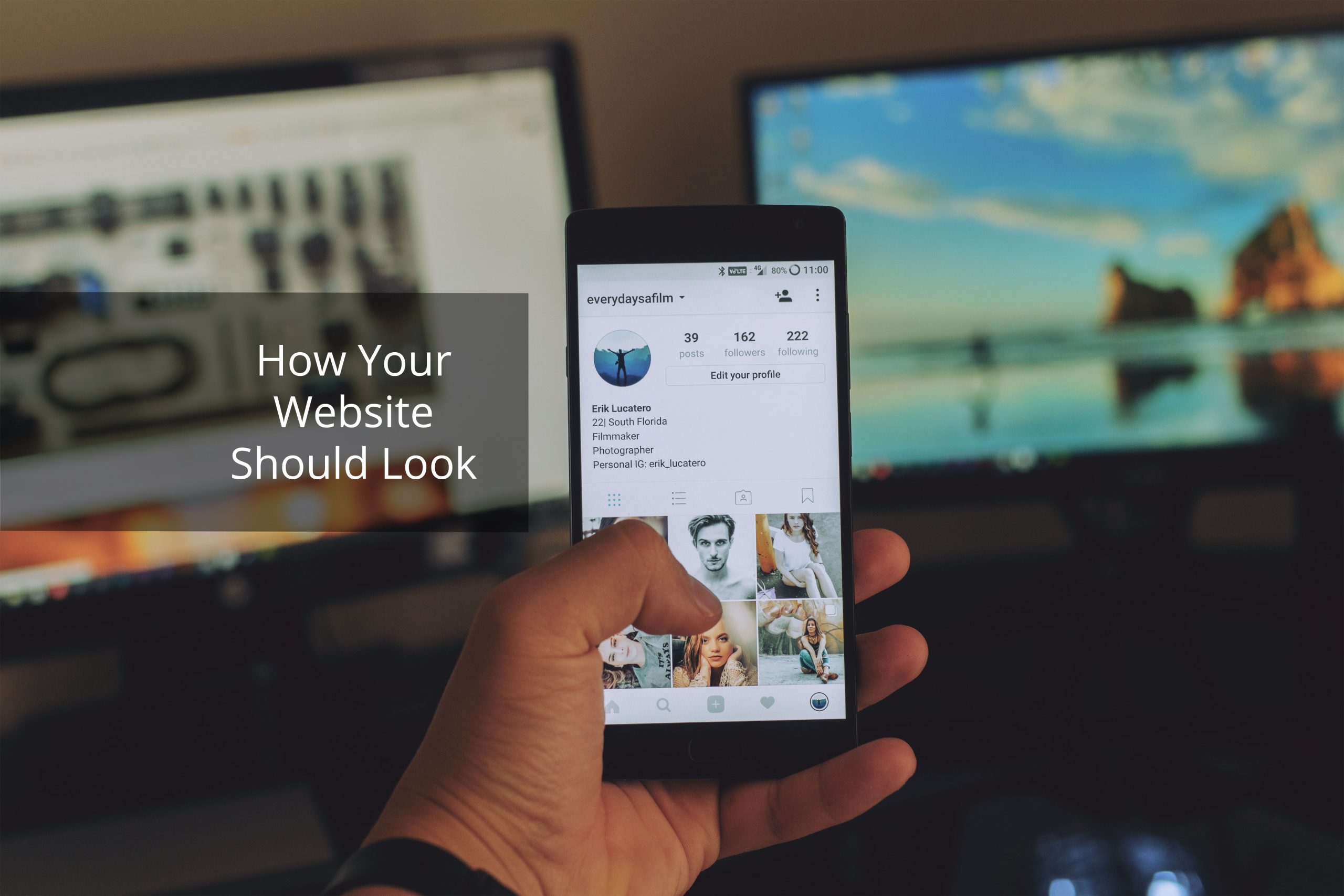
Smartphones changed all of that. According to Statista, over half—52.2%—of all web pages in 2018 have been loaded on a mobile browser. That trend is here to stay. Four years ago, when a tick over one quarter of web traffic was from mobile phones, you could get away with sloppy mobile design. That is simply not the case now. Your website should look good on mobile.
There are two main ways to do this. One is to build a custom mobile site that is design-wise markedly different than your desktop site. The other is to purposefully create your desktop site to scale to mobile screens. Either way, mobile-friendly design is imperative.
One of the most important visual aspects of website are the menus. Very few sites can be properly displayed on a single page, and so menus are a functional necessity for almost everyone.
It should be immediately clear where your menus are taking visitors and how to navigate submenus. You can show a little flair in terms of color and font choices, sure, but this is a case where bad visual design will discourage visitors from continuing and may lose you a sale.
Common design language is common for a reason: it works. Unless you have a great plan, sticking with a standard row of top menus or the ‘hamburger’ menu (the one with the three parallel lines) is a good idea.
It is extraordinarily easy to over-design something, to pack it with so many neat visual features that it accomplishes the opposite of its intended function. Stay far away from that temptation. In design, less is often more. Sure, it’s possible to under-design something, but that approach rarely leads to bad looking websites—merely bare ones.
Design language in 2018 borders on minimalistic. It’s clean, easy to decipher, and naturally shifts your eye towards more detailed areas you want them to go. Google’s logo change in 2015 is a great example of current design language.
Regardless of your visual style, it’s important to remember that less is indeed more in website design. Visitors don’t need to know everything about your website. They’re looking for something specific. The faster they can find what they’re looking for, the faster you’ll get their business.


“The USI team was very professional and insightful. They made the process easy and answered all of my questions. I would definitely recommend USI to anyone.”

“The work completed by US Insourcing shows they are veteran SME consultants. They delivered a completed and well researched document. Thank you!”

“They did an amazing job. Delivered a complex and functional financial model for use by our organization.”

“The USI firm is led by very knowledgeable and experienced consultants. I would highly recommend hiring them to assist you with your business plan project. ”

”We asked the USI Digital team to assess our marketing potential and whether social media or pay per click would be more beneficial. They first spent time researching the market and costs and then came back with a workable plan. Well Done!!”